Stanford Continuing Studies
Homepage concepts to explore new design directions for Stanford's continuing education program
The starting point
Stanford Continuing Studies was preparing to redesign its website, and Stanford Web Services brought me in as a contractor to explore what it could become. I designed two homepage concepts, each taking the Stanford brand in a different direction, to give the client something concrete to react to.
Editorial
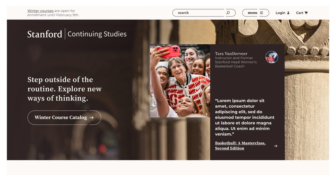
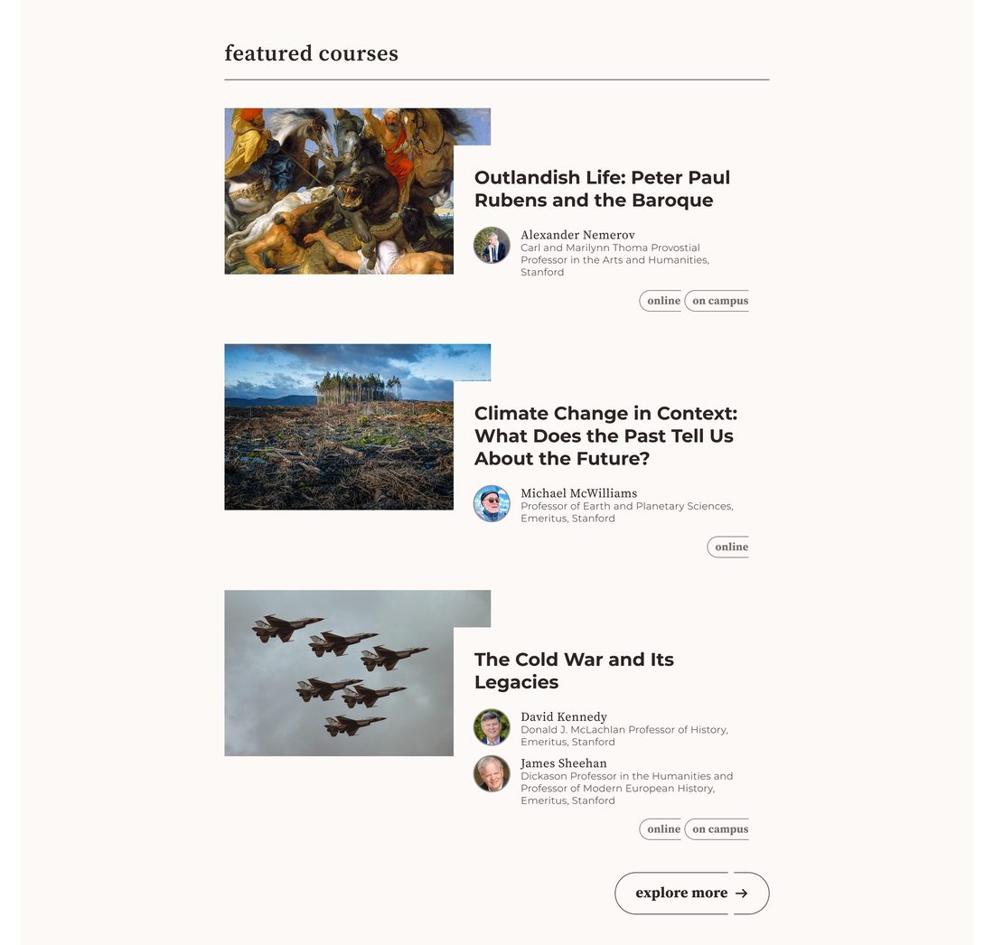
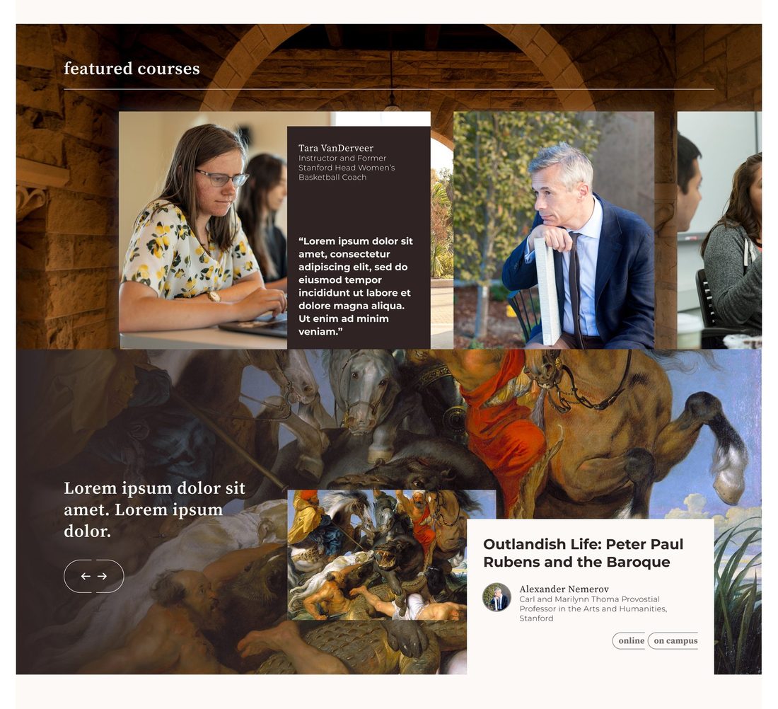
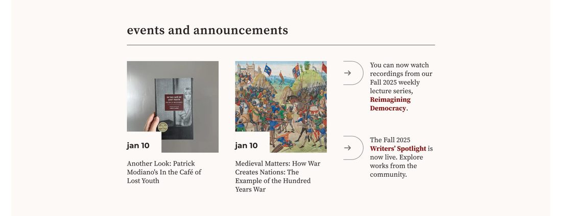
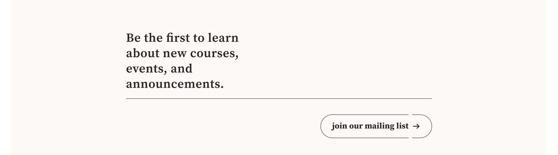
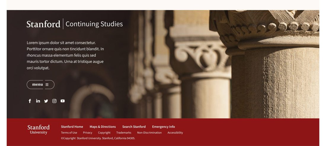
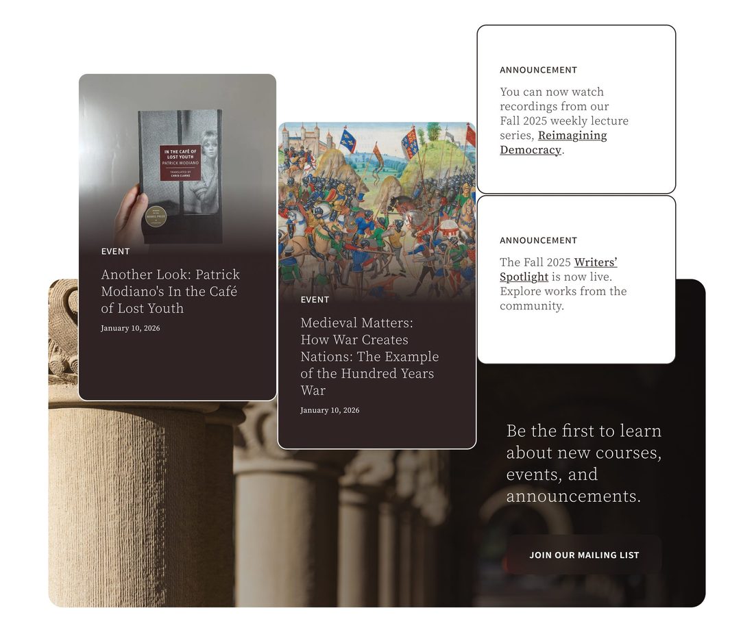
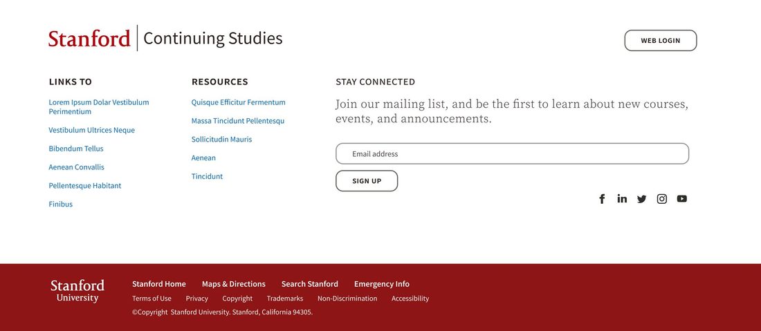
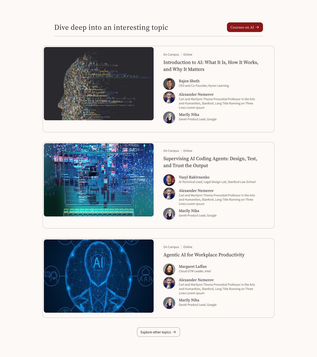
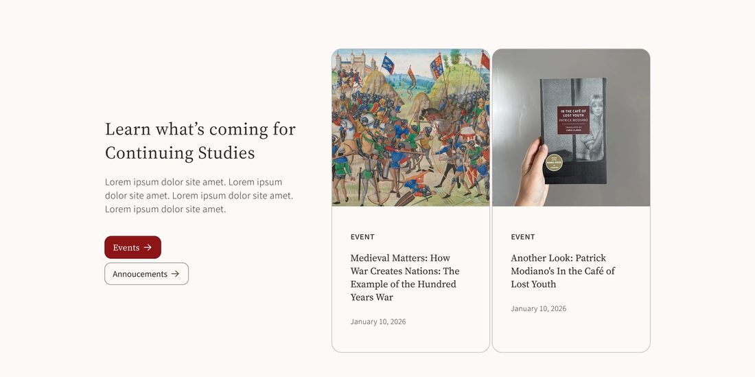
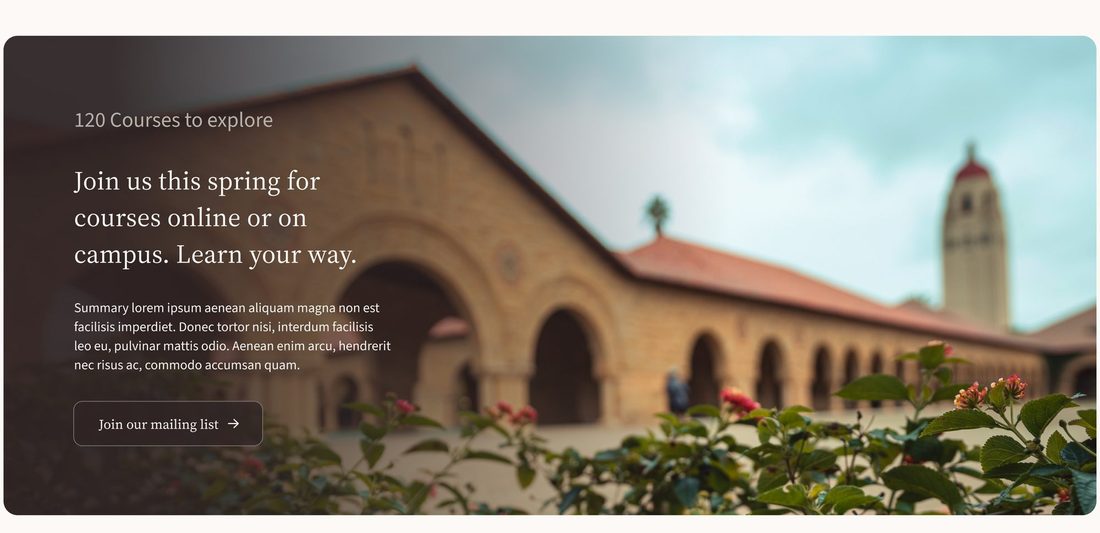
An editorial, magazine-inspired direction. Deep espresso tones and sandstone photography set a warm, scholarly mood, while layered images and instructor quote cards put the people behind the courses front and center. Lowercase serif headings and outlined pill buttons keep it calm and confident.
Cards and circles
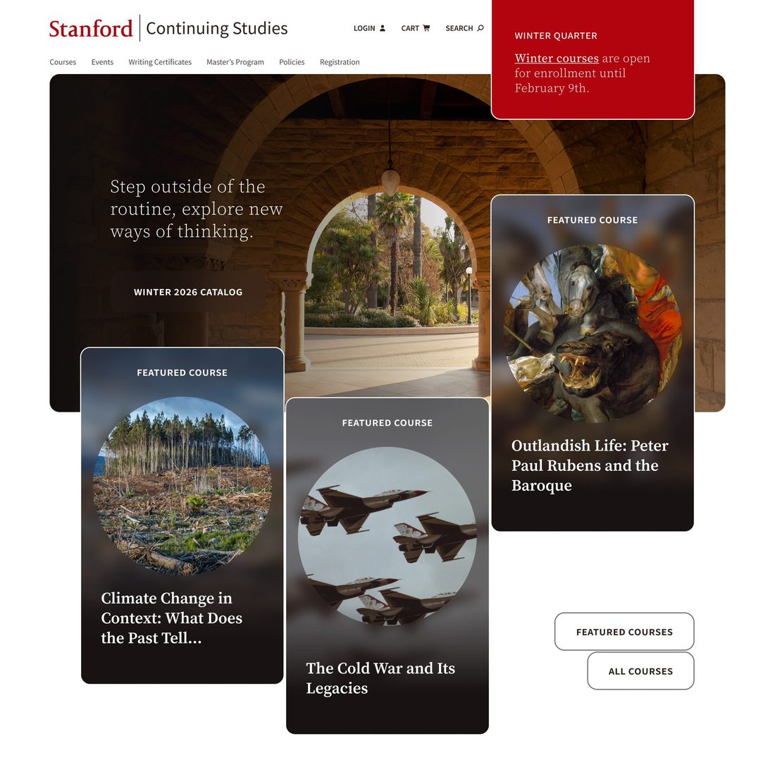
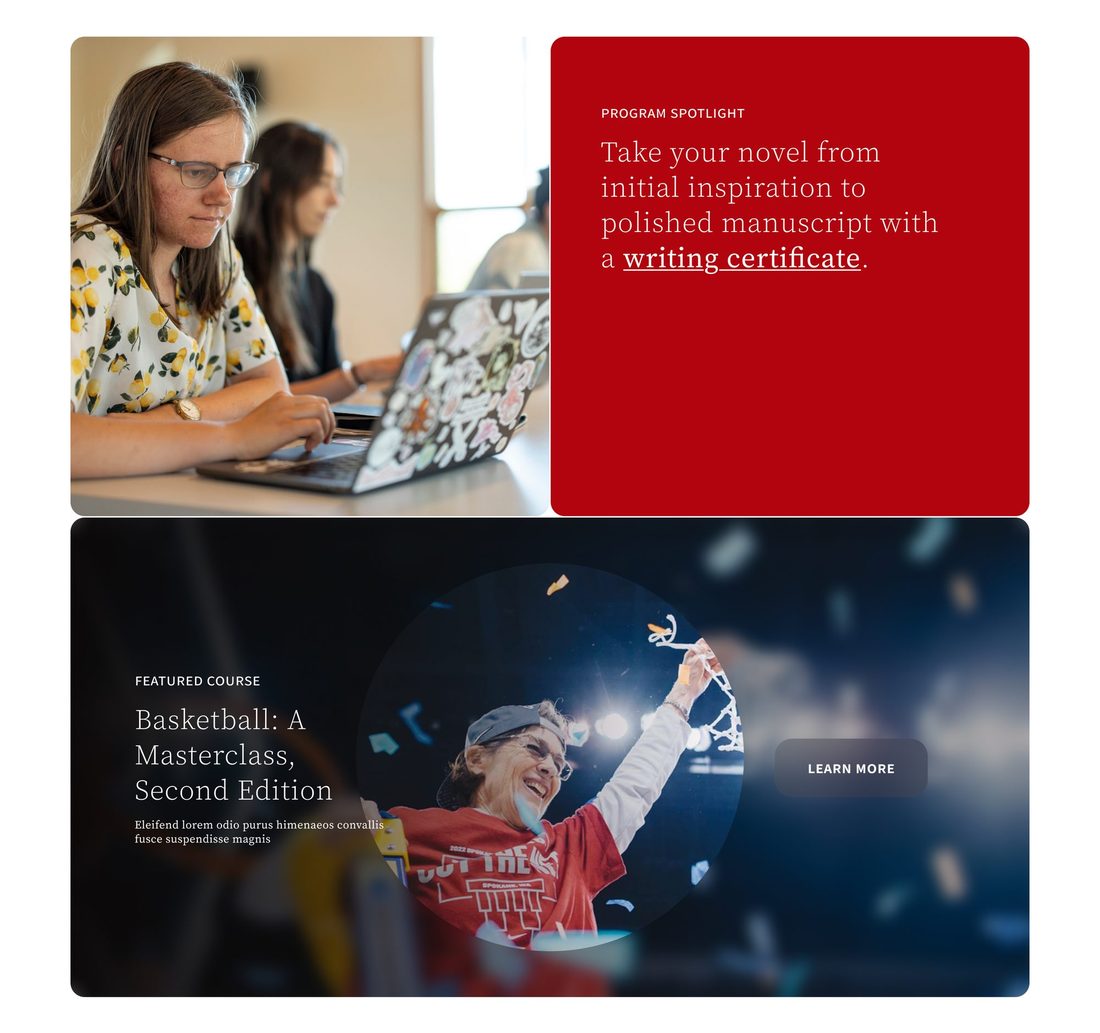
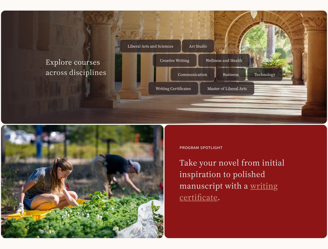
A bolder, more playful take built on rounded cards and circular image crops. Featured courses spill over the hero photo like a hand of cards, and full-bleed Stanford red blocks give program spotlights real presence, making a deep catalog feel inviting to browse.
Bringing it together
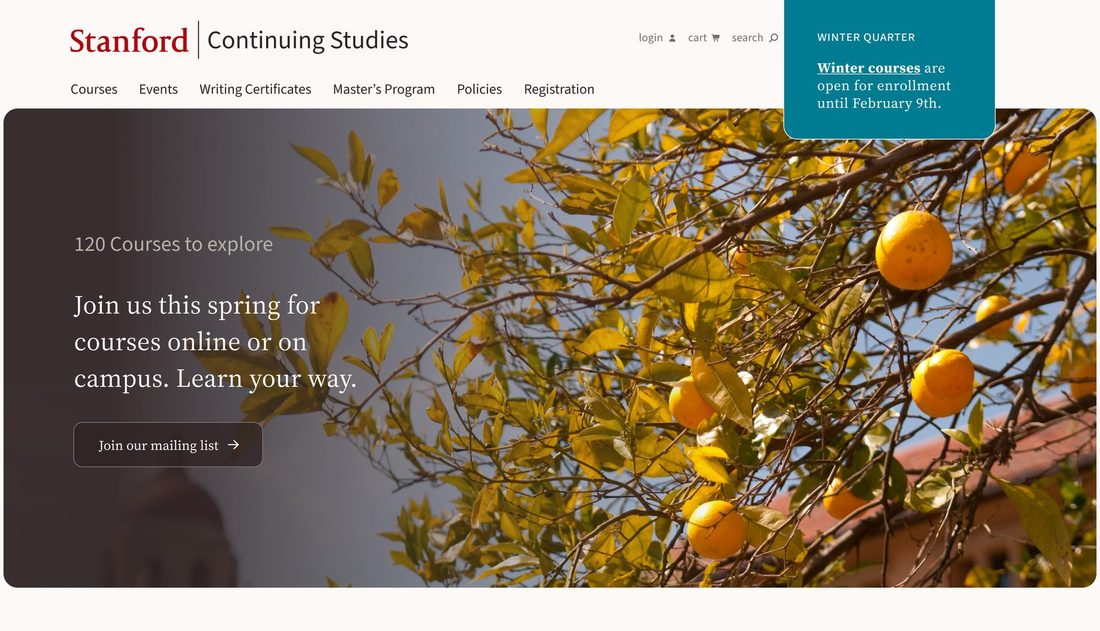
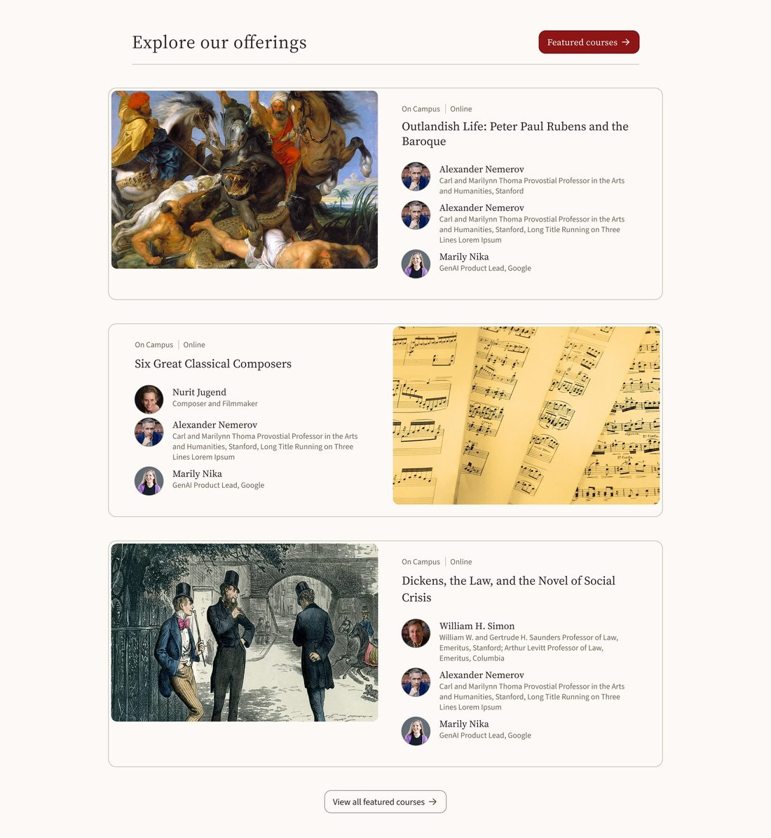
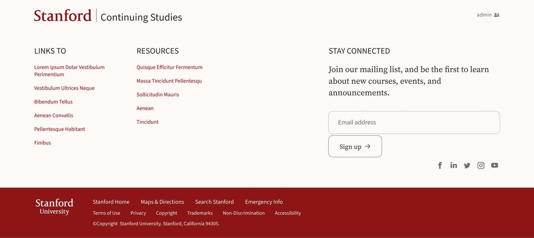
The client saw something they liked in both concepts. Working with the Stanford Web Services team, I helped carry the strongest ideas from each into one final homepage: warm sandstone photography and serif headings from the editorial direction, with the bold Stanford red spotlights from the playful one.

Pushing a brand beyond its comfort zone, generating distinct visual directions quickly, and giving clients real choices to react to.