Stanford Momentum
A flexible system of building blocks for bold, cinematic storytelling
The starting point
The Office of Development wanted a storytelling site for Stanford Momentum that felt cinematic and broke from the usual Stanford look. The brand came from an outside agency and was designed for print, so the challenge was bringing it to life on the web.
I worked on the project as part of the Stanford Web Services team, alongside a fellow designer, a developer, and a project manager. Our goal was to give the Office of Development a flexible set of building blocks, so every new story could have a bold, cinematic page.
Components, not pages
Meeting with the client twice a week, we explored how the brand's bold type, imagery, and graphics could translate to the screen. From there, I turned our concepts into a system of reusable components that could be mixed and matched to tell many kinds of stories.
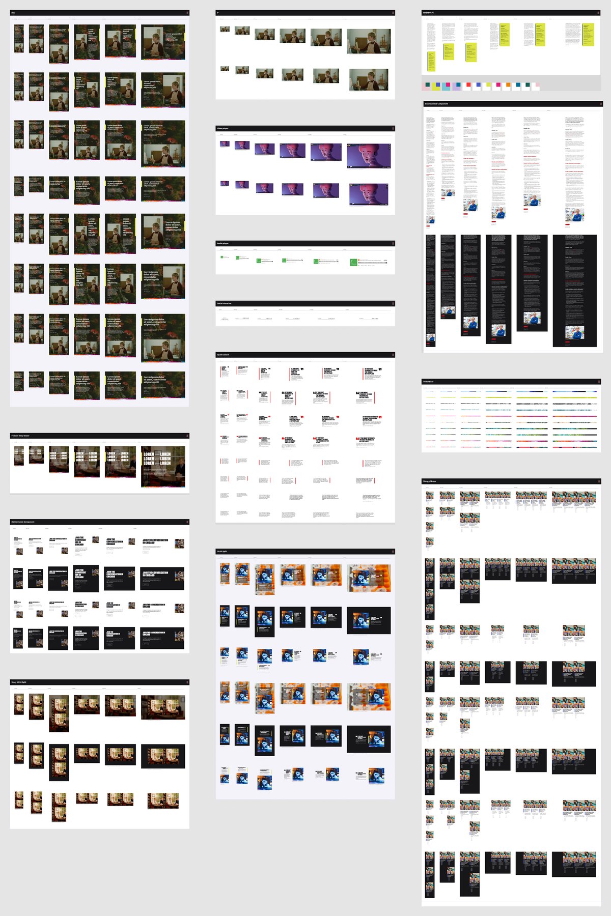
Each component was documented in a table showing every variation at every screen size. That flexibility paid off when the brand guidelines changed several times along the way: the system adapted without slowing us down.
Designing with development
I worked closely with our developer throughout, from small tweaks to bigger structural decisions, so the designs held up in the build. Together with Stanford's Office of Digital Accessibility, we checked color contrast, tuned the type for readability, and added a reduced-motion option.
What authors can build
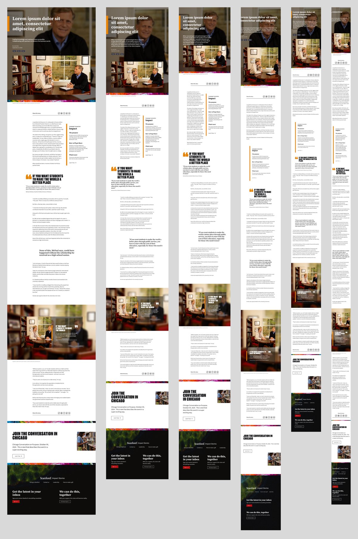
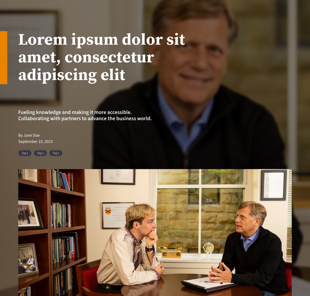
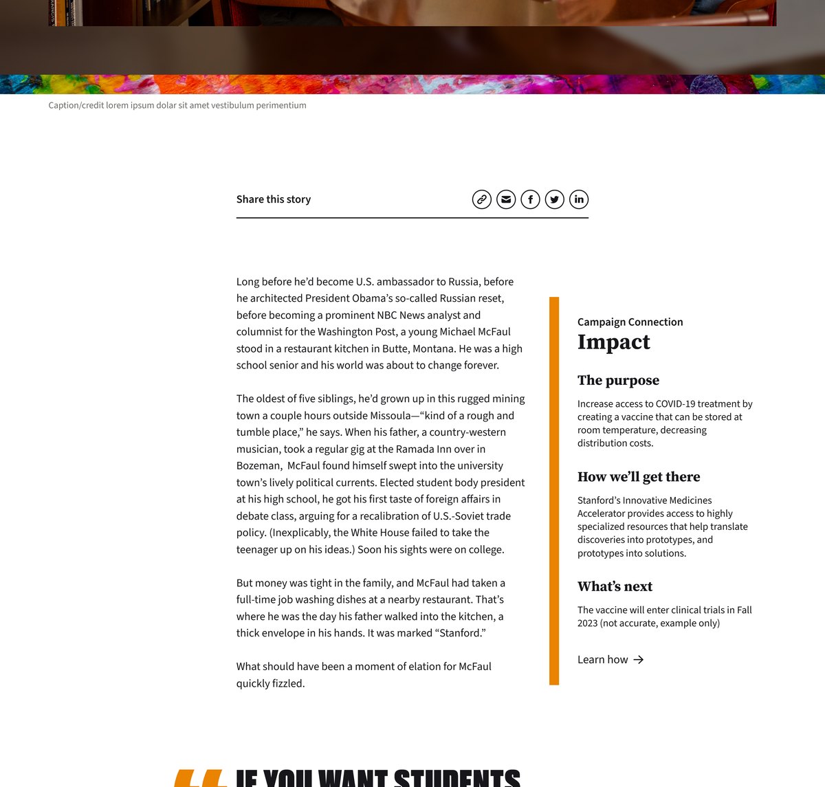
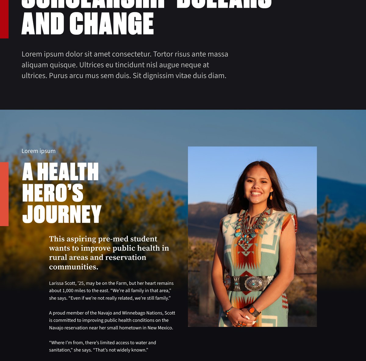
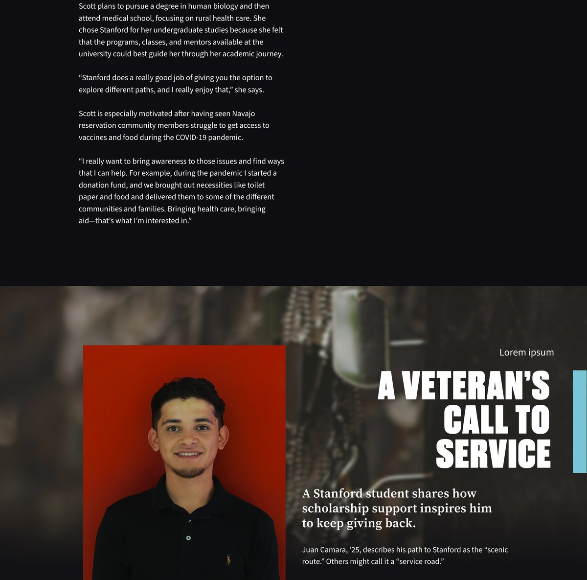
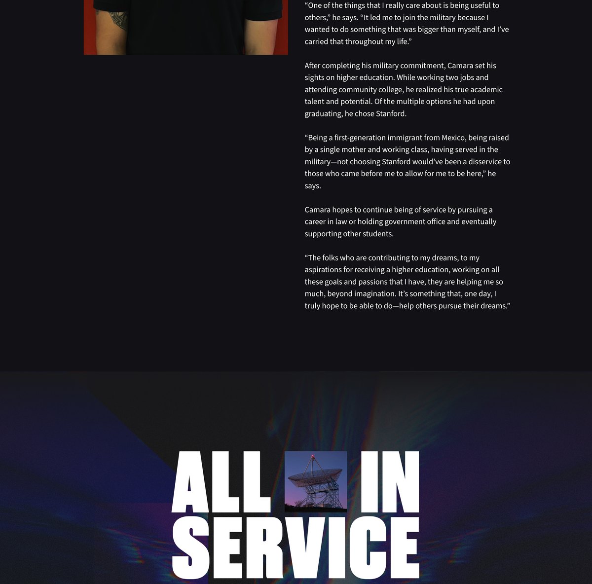
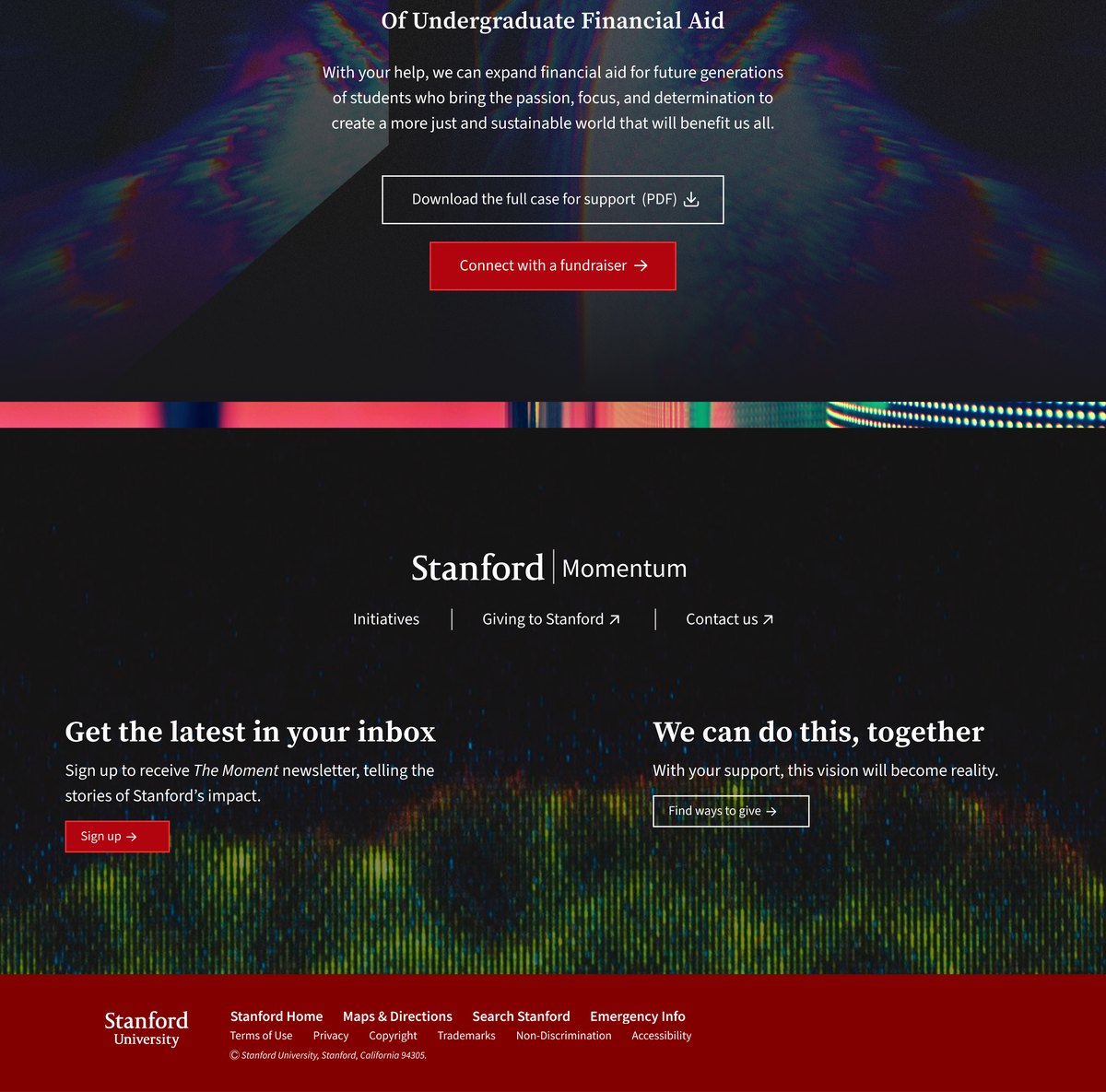
To show what the system could do, I mocked up example pages built entirely from the components.
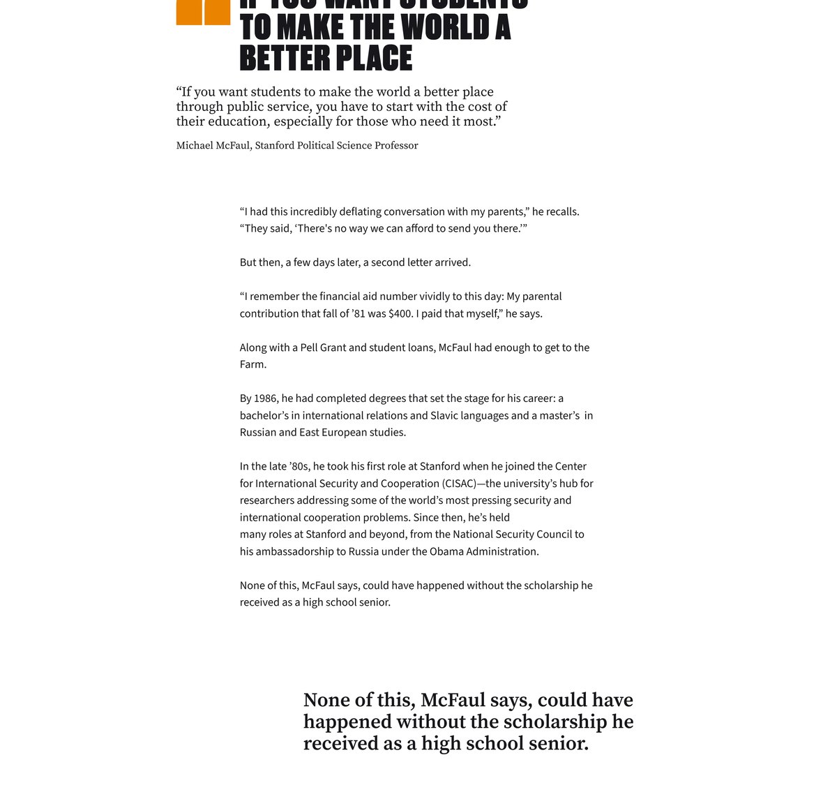
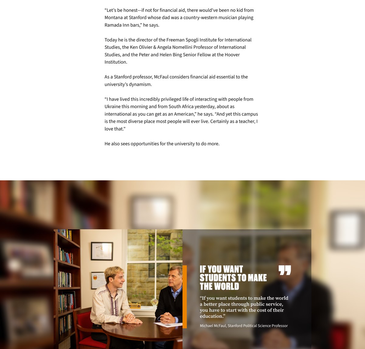
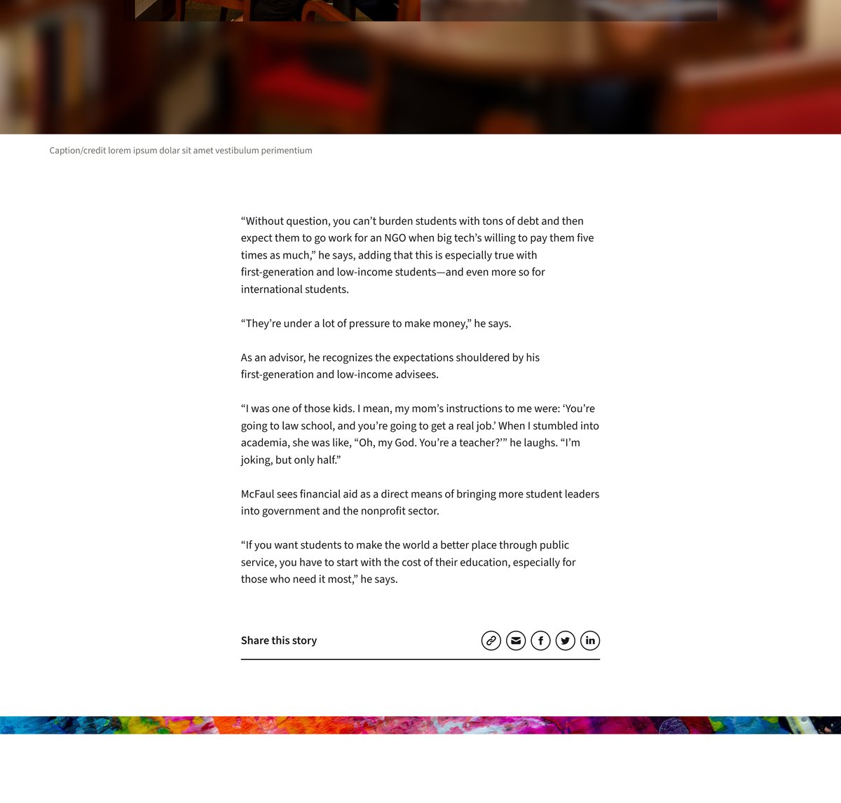
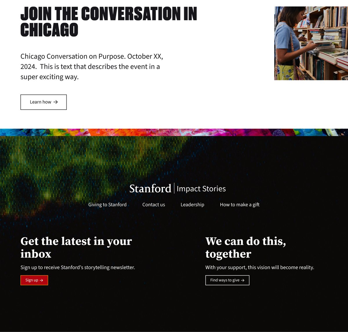
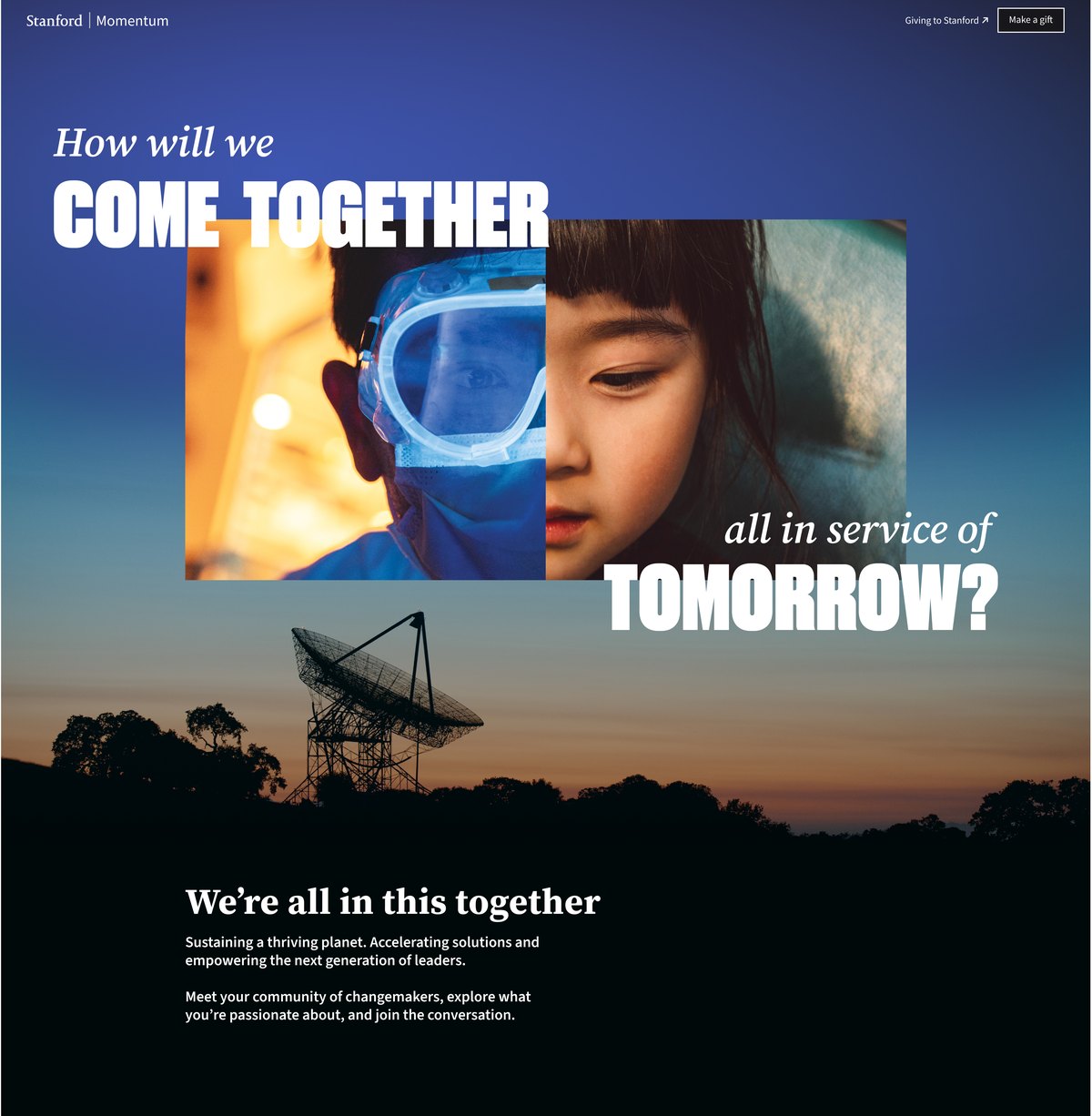
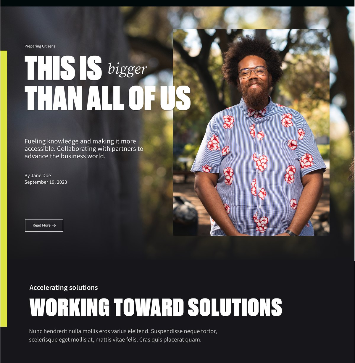
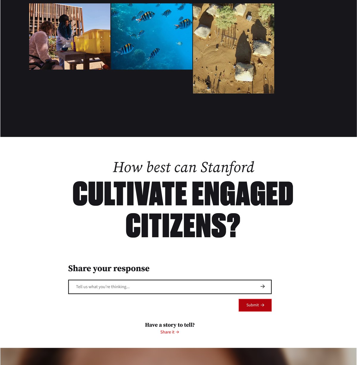
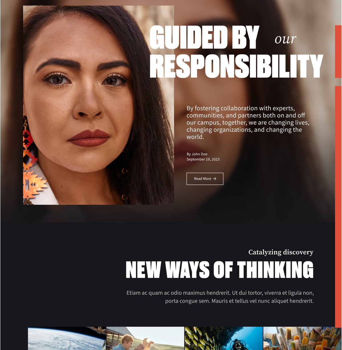
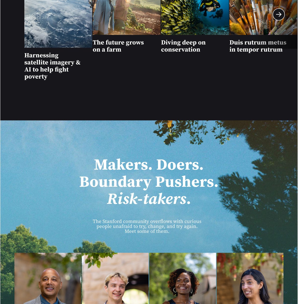
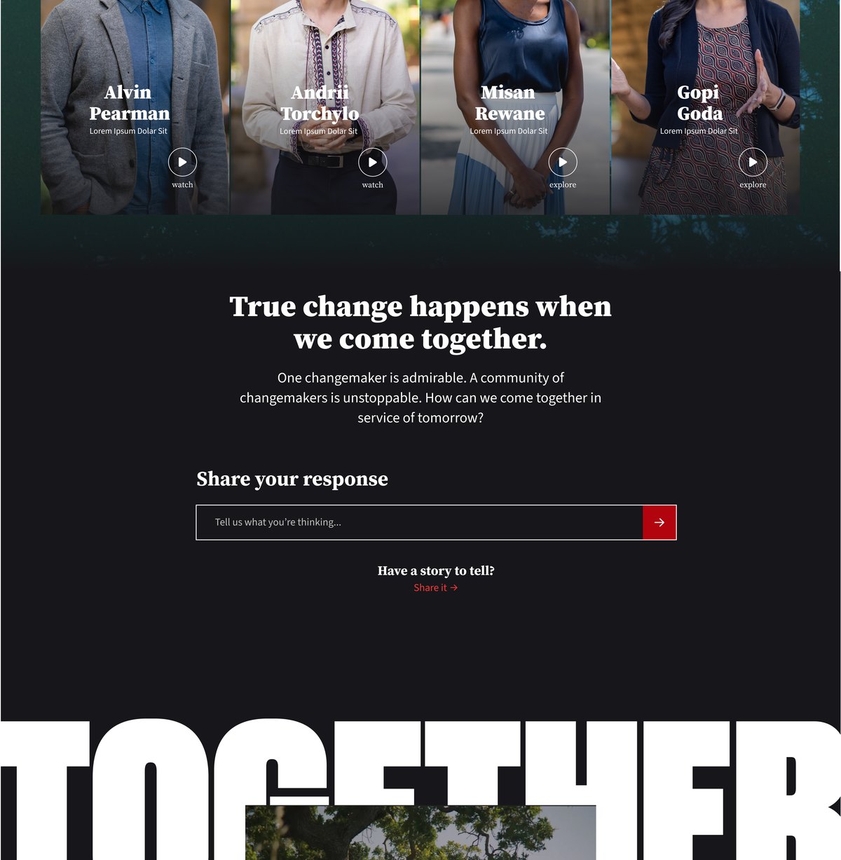
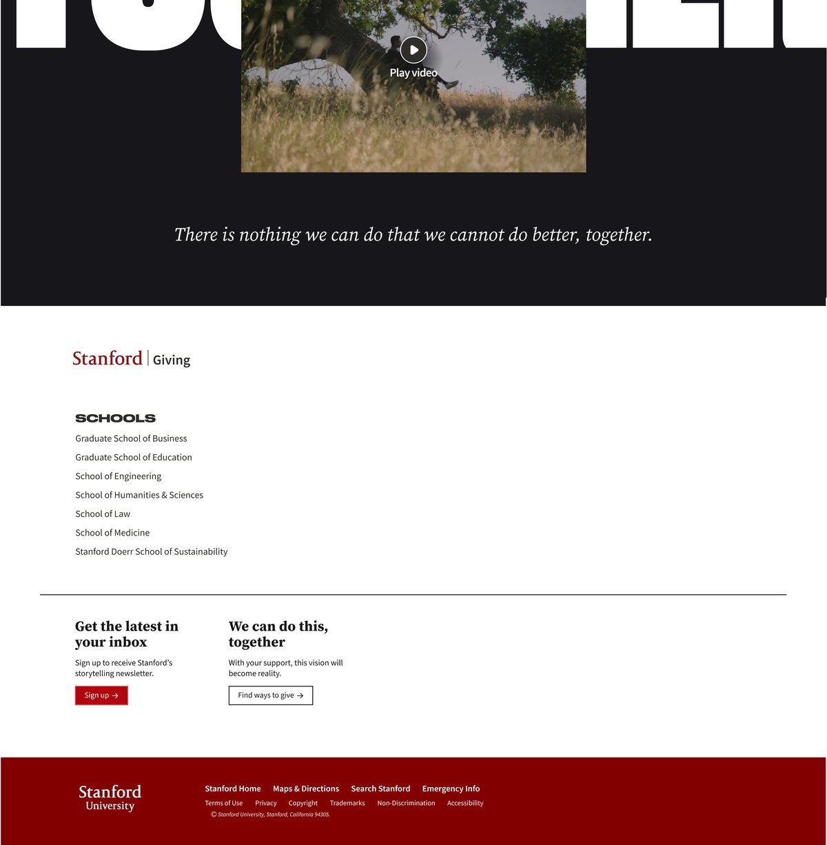
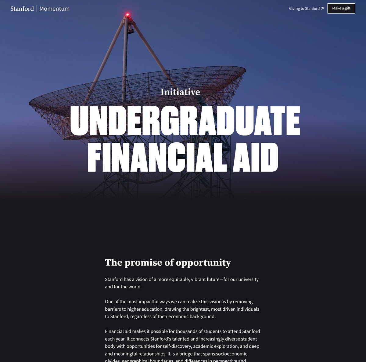
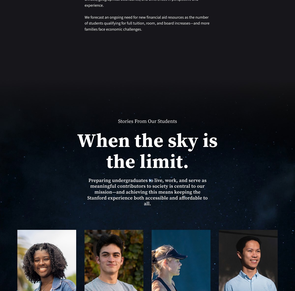
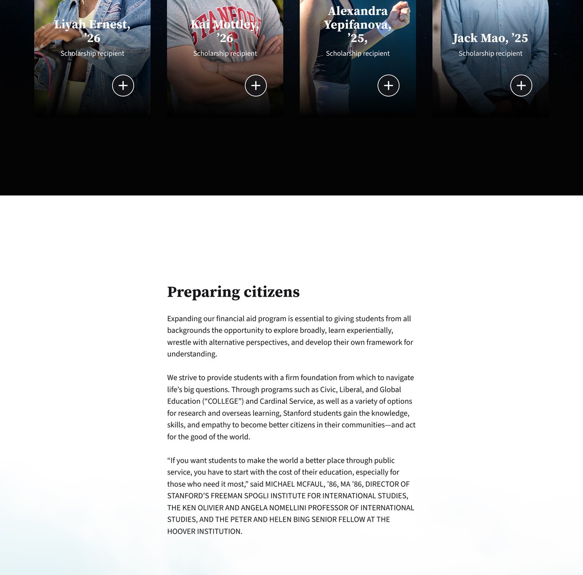
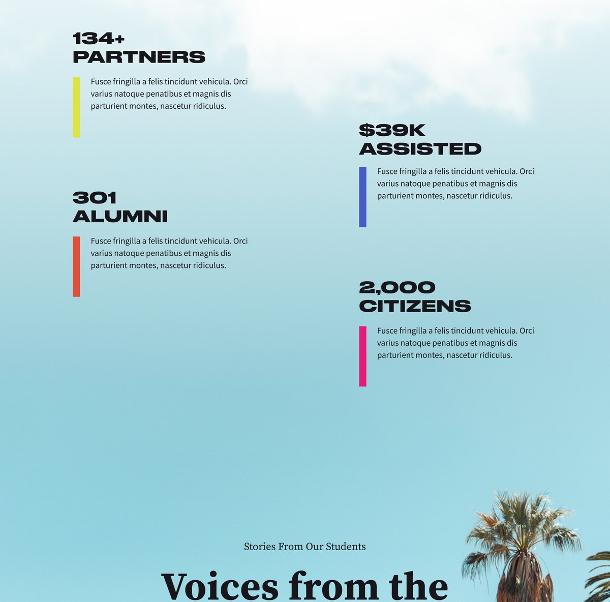
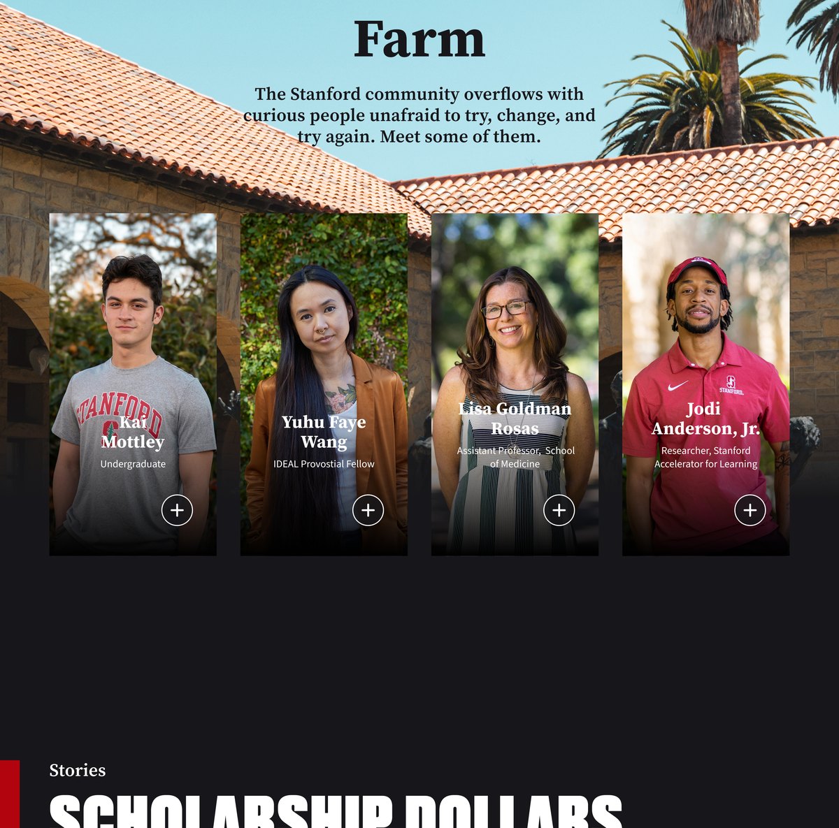
Translating a print brand to the web, designing a flexible component system others can build with, and partnering closely with developers to bring it to life.