Stanford Summer Session
A sun-soaked redesign of Stanford's summer program website
The starting point
Stanford Summer Session needed a new website, one that celebrated the student experience beyond the classroom and set the program apart from other universities' summer offerings. Working with a team at Stanford Web Services, I led the visual design, from the first mood boards to the final design system.
Starting with the content
Before designing anything, we held working sessions with the client to define their goals, looked at how other universities present their summer programs, and audited the existing site. Mapping the content showed where student testimonials, comparison charts, and photo galleries would help most, and those became the building blocks I designed around.
California poppies
From there, I explored directions through mood boards and refined them with the client and my colleagues. The one we chose is built on bright, saturated imagery of students, natural textures, and campus life. The feeling is golden-hour California, warm and full of life.
Every element draws from Stanford's identity guidelines, applied in a fresh way the brand is built to allow.
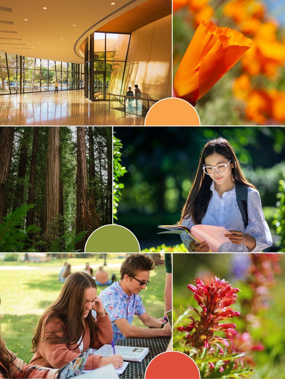
Playful, yet elegant
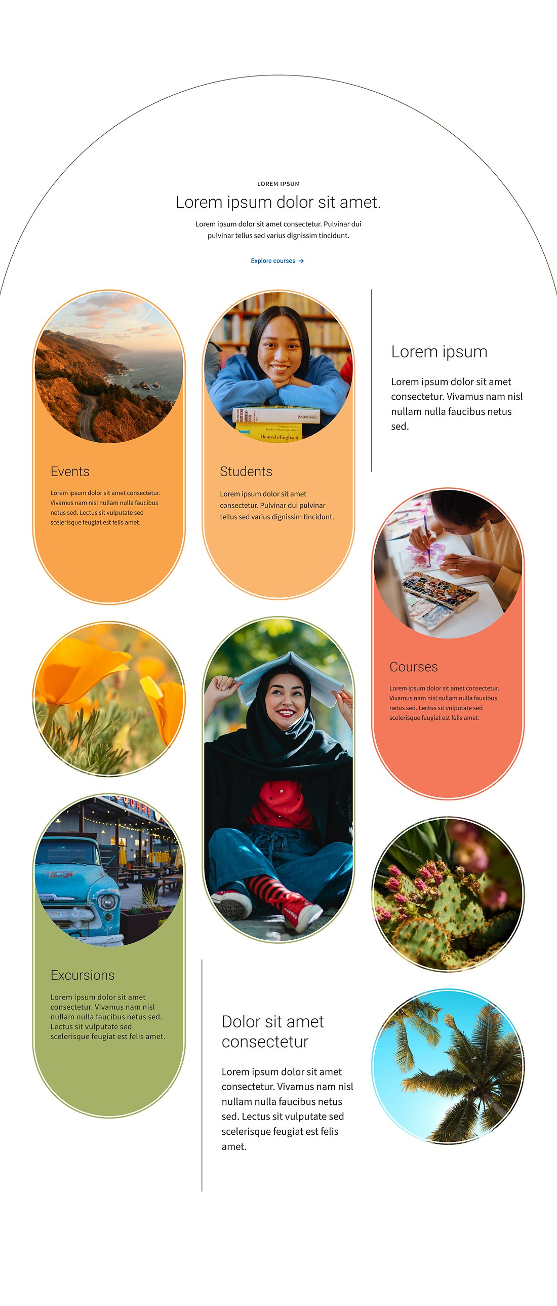
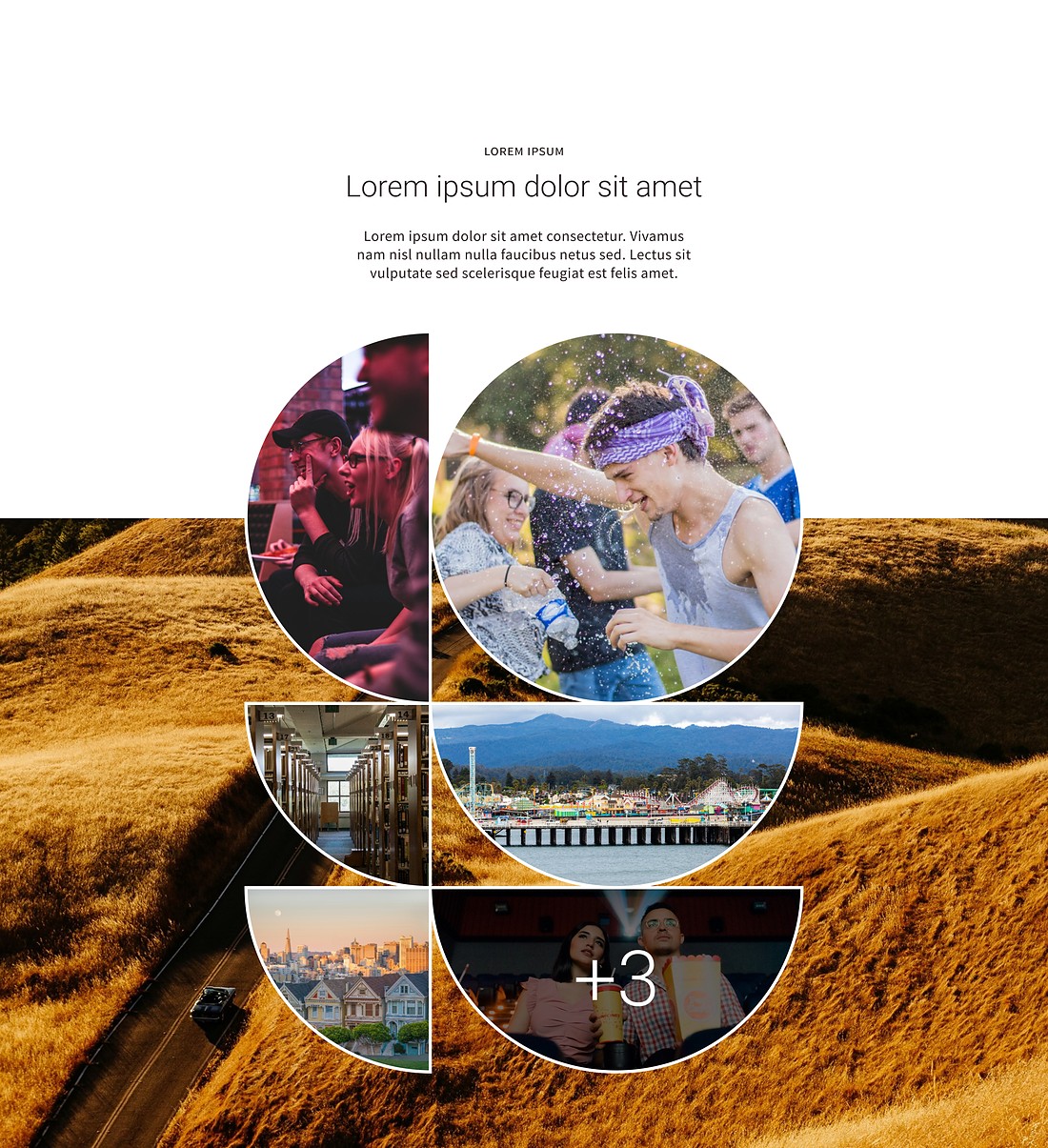
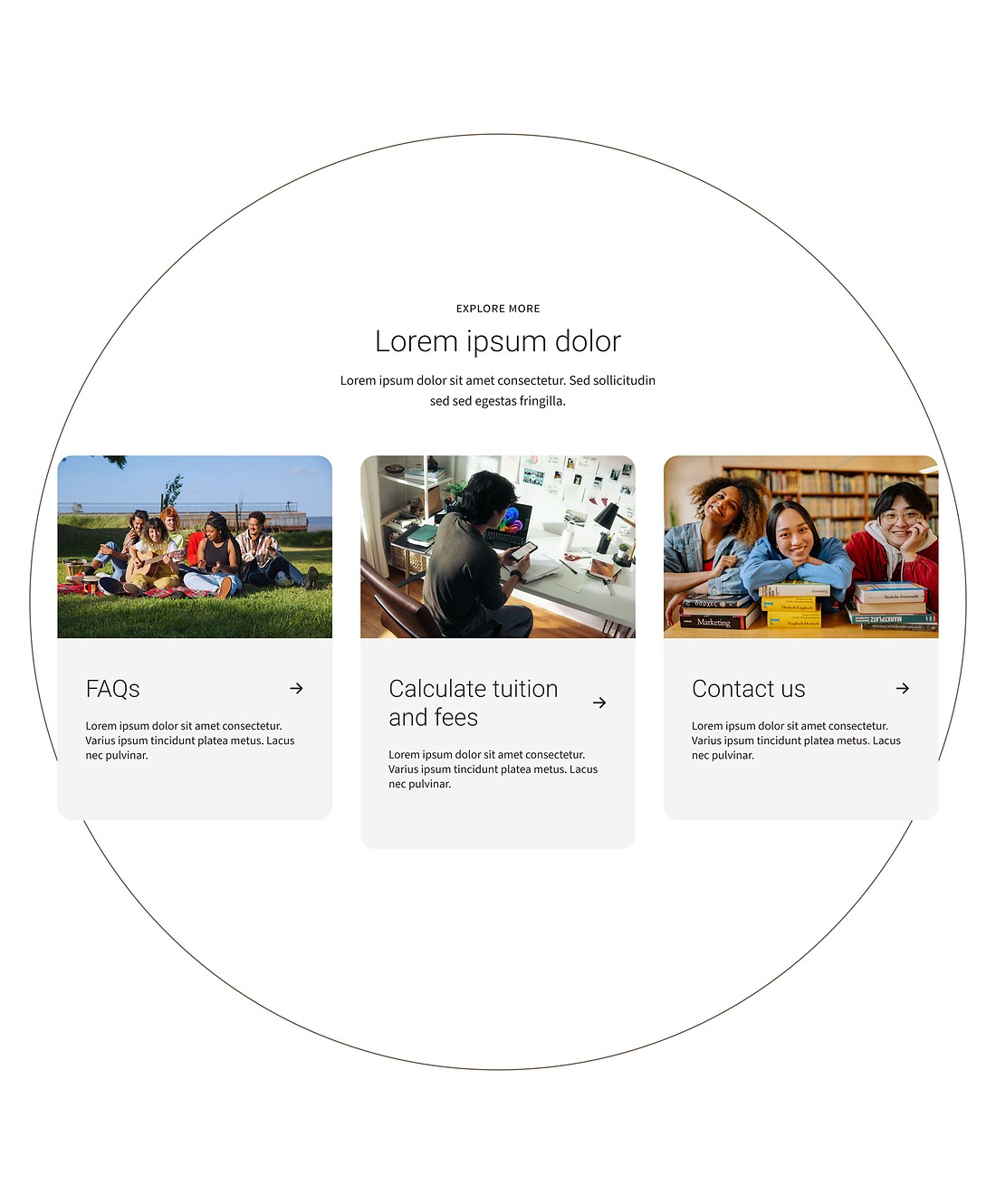
Pills, circles, and arches frame photos and content across the site, with a fine offset outline that keeps the bold shapes in balance.
Retro rainbow
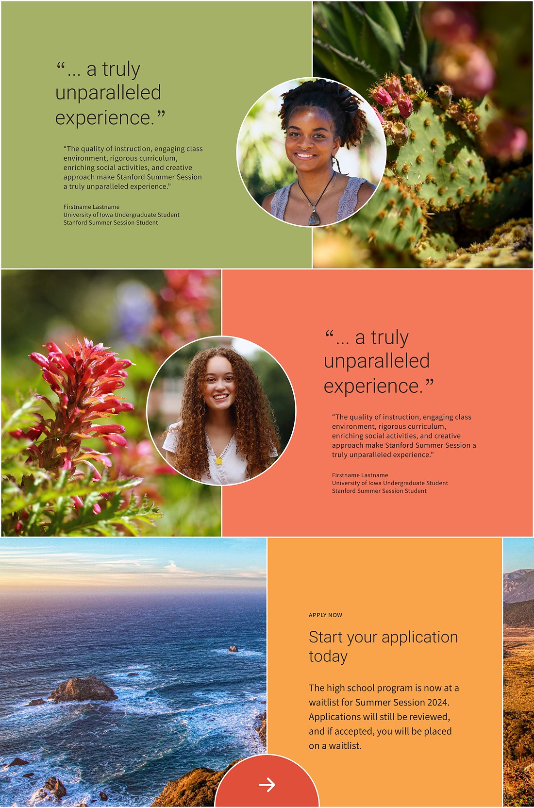
Inspired by the California coast at golden hour, these warm, saturated hues drench much of the site in color.
Shapes meet color
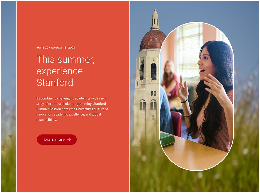
Here the arches, pills, and circles start to hold photography in the retro rainbow palette, setting the rhythm for the whole site before it all became components.
The look comes to life
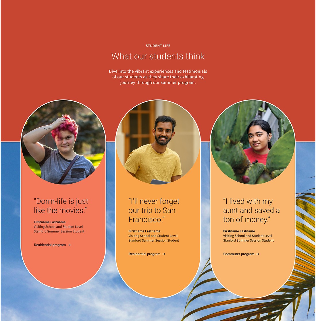
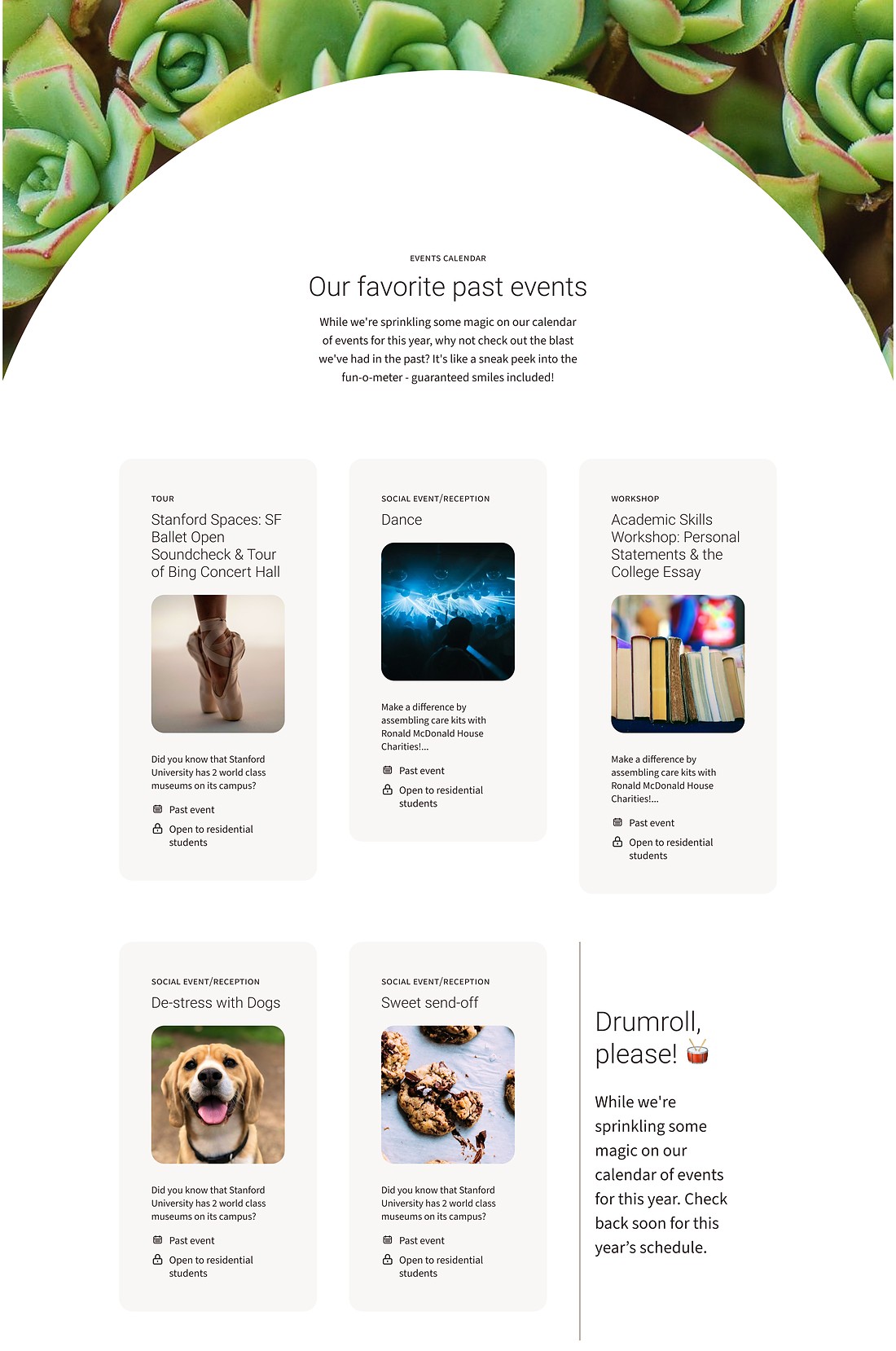
The shapes and palette came together in a flexible set of components, from bold, stylized pieces for moments of energy to calmer, timeless variants for everyday content. Testimonials, galleries, and feature blocks grew straight out of the content mapping. Here are some examples from across the site.
Big goals, tight timeline
The client had ambitious goals and a limited budget. I shared work early and often, met weekly with the developer to solve technical challenges, and kept open conversations about scope throughout. At the end of the design phase, I led the client through prioritizing components by impact, so the most important pieces were built first. I documented every component and how it responds across screen sizes so the developers could build it with confidence.
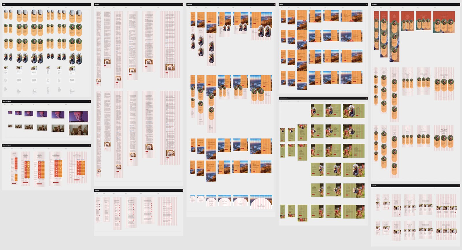
Creating a unique expression of the Stanford brand, designing for both bold and quiet moments, and helping the client prioritize what mattered most.